Selected Past Projects
Ruby Fluorescence Decay
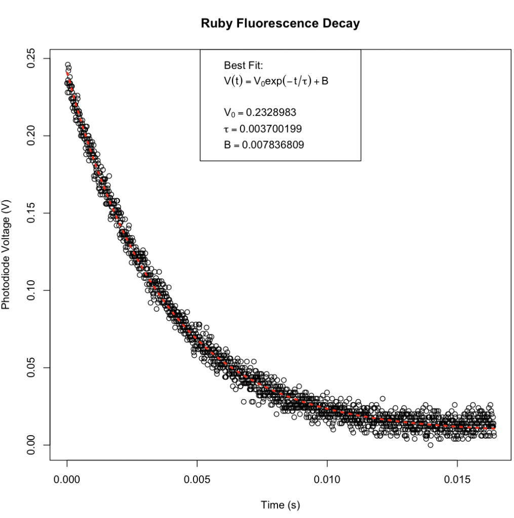
A friend of Sarah’s who works in academia had developed a laboratory exercise and was preparing to present it in a workshop at a conference. They had collected data and fit the known model in a spreadsheet, but wanted a more professional plot and an improved fit. By applying a least-squares fit using the Gauss-Newton method built into the nlm() function in R, she was able to find an improved fit. In just a couple hours, she was able to fit the curve, make a professional plot, and teach her friend how to do the same. The plot is below, along with some interesting statistics giving an indication of the statistical significance of the fit and 95% confidence levels for the parameters and values predicted from the fit.
The estimated variance can be used to calculate an approximate F statistic in the large-sample or asymptotic limit.

Because of the large number of samples (n = 1642), this asymptotic result should be valid.

For this large value of the approximate F statistic, P < .001, and the probability of obtaining such a high value purely due to chance is very small.
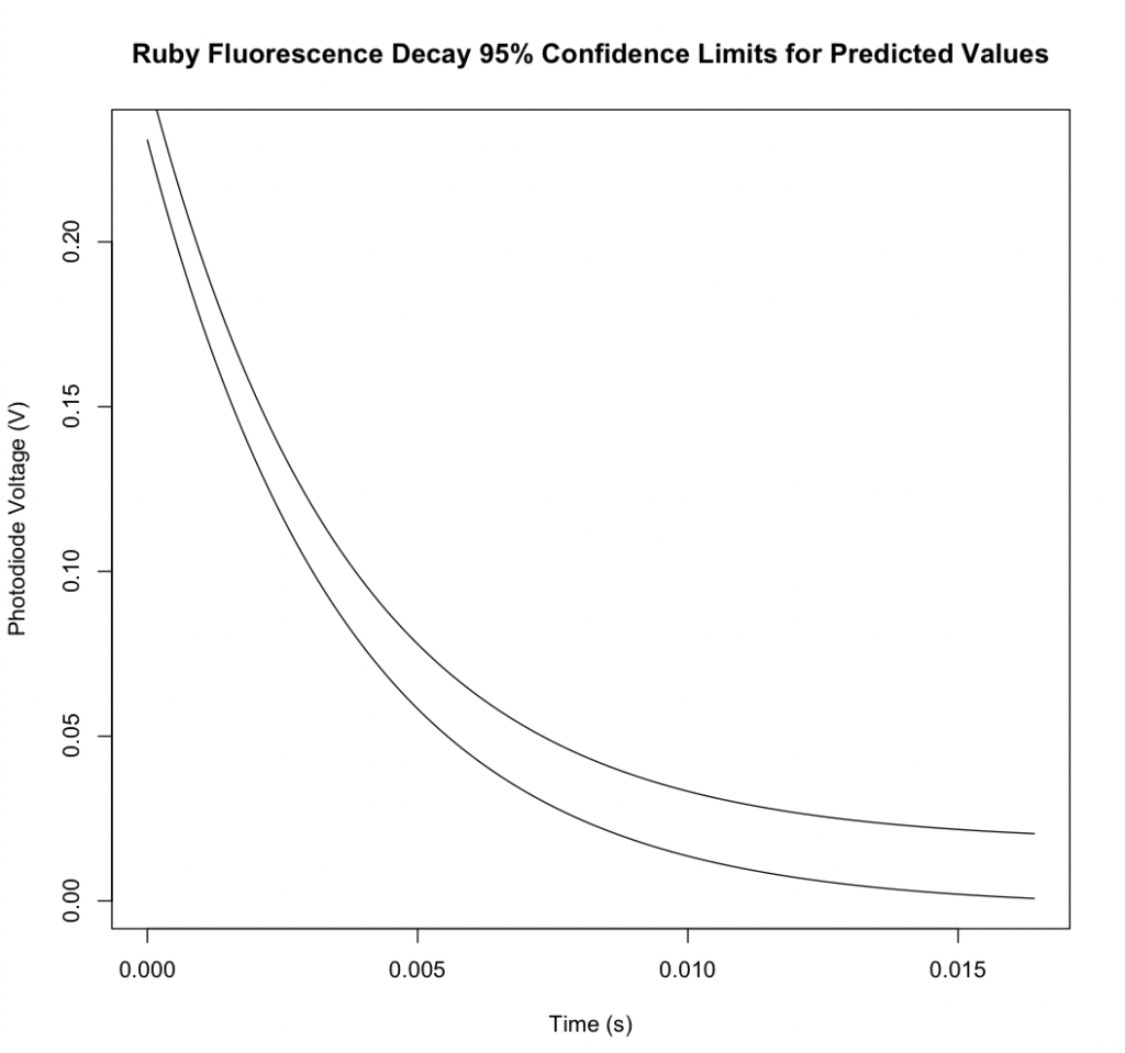
95% confidence levels can be computed for the parameters and values predicted using the best fit equation:


PTP Analysis for ASTM D02.07
Background of work:
The ASTM D02.07 Subcommittee on Flow Properties of Petroleum Products is charged with conducting activities related to promoting the use and improvement of standards that characterize flow properties of petroleum products, liquid fuels, and lubricants except for grease. One of the ways the subcommittee monitors its standard test methods is through the use of the ASTM’s Proficiency Test Program (PTP). Samples are sent to participating labs several times each year, and the labs run a number of tests according to standard test methods. The officers of ASTM D02.07 monitor results for a number of methods, including ASTM D2983 Standard Test Method for Low-Temperature Viscosity of Automatic Transmission Fluids, Hydraulic Fluids, and Lubricants Using a Rotational Viscometer, to see if are performing as expected.
Over the past several years, a lab had raised concerns over the PTP results for a particular gear oil sample, so the subcommittee began to closely track the Test Performance Index (TPI) for each PTP cycle. The TPI is a measure of how closely the reproducibility of the PTP sample matches the reproducibility published in the method. TPI values of 1.0 indicate the reproducibility of the sample matches that of the method. Lower TPI values may indicate that the sample had worse reproducibility than was published. As the chair of the subcommittee section overseeing ASTM D2983, Sarah Nuss-Warren of SNW Data Analysis, LLC volunteered to further examine the question of why there were low TPI values for this test method and whether any corrective action was needed. The subcommittee recommended suppressing statistics while the matter was investigated. The presentation below was shared with the D02.07 Subcommittee at the ASTM June 2022 Committee Week.
Work product:
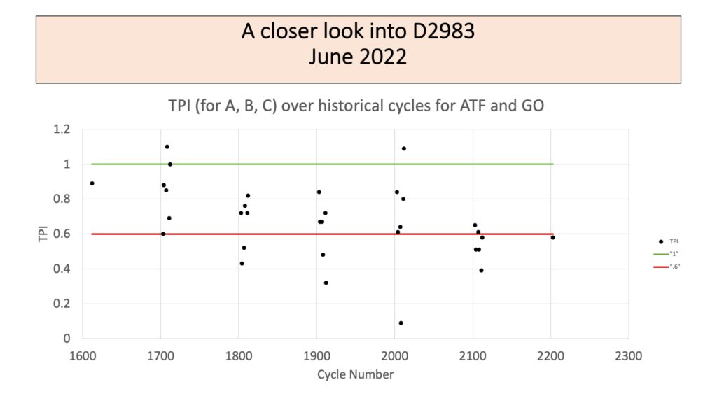
Values of 0.6 or less are typically statistically significant given the number of measurements included in most PTP cycles for this method. There have been a number of TPI values below 0.6 since 2018 (cycle numbers 1800 and greater).
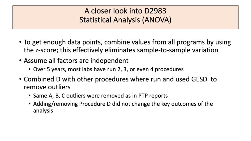
Note that lab number did not stay consistent throughout the analysis, so any lab effect will not be detected.
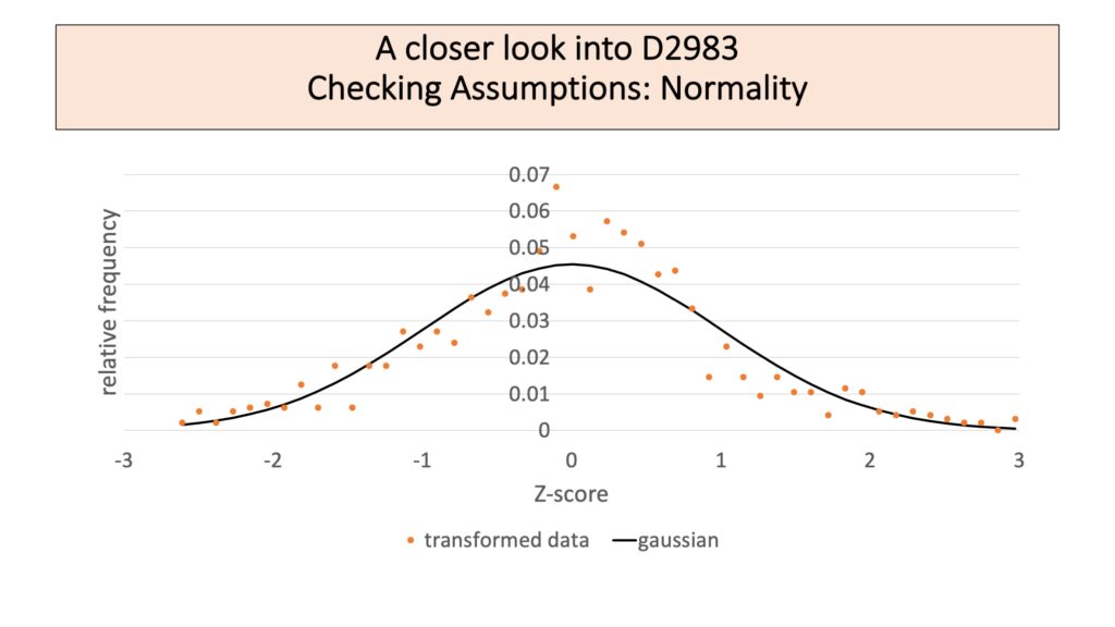
The transformation to z-score effectively mapped the data set onto a normal distribution with a mean of 0 and a standard deviation of 1. While this is expected to hide any program effects, it lets all the data be combined.
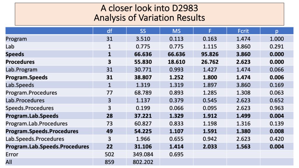
An analysis of variation (ANOVA) indicates strong effects in speeds and procedure with speeds giving the strongest effect. This is not surprising. The method indicates that measurements at different speeds are not to be combined. Many of the problematic TPI values from the previous years occurred when samples were taken at multiple speeds. Interaction effects are much smaller but still significant any time Program and Speeds are combined. This suggests that there may be a sample-specific effect where different speeds give different results for certain samples.
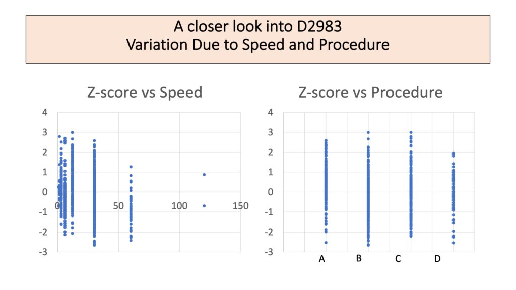
This is a visual check to make sure the analysis is believable. There really does seem to be a change in Z-score with speed. A difference due to procedure is plausible from the graph.
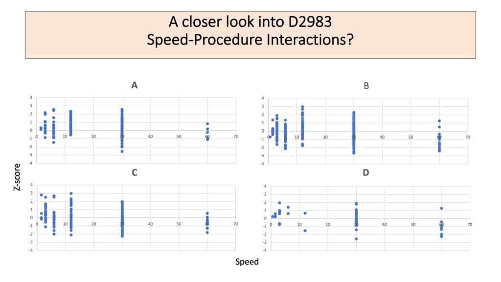
For each procedure, speed continues to have a clear effect. Some difference between the speed effects for each procedure are plausible.
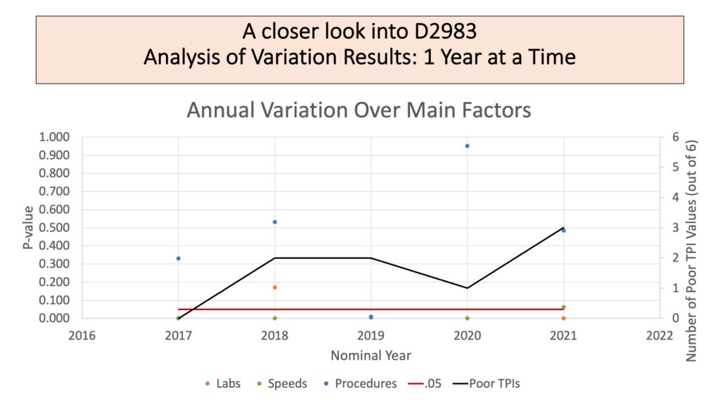
This plot shows an attempt to understand how the factors evaluated seem to be impacting TPI over time. The black line shows the number of poor TPI values in the 6 PTP reports every year. A higher value on the line indicates poorer reproducibility evident among the PTP samples. The points show the P-value for the ANOVA factor that year. The red line indicates a P-value of .05, which is the standard value chosen to indicate statistical significance. For most years analyzed, speed was an important factor. Procedure and lab were only occasionally important factors in the variation among results. Even though lab is not stable over many cycles, lab number is likely to be consistent across a single year. However, the number of poor TPI values in a year does not obviously correlate to any one of these factors.
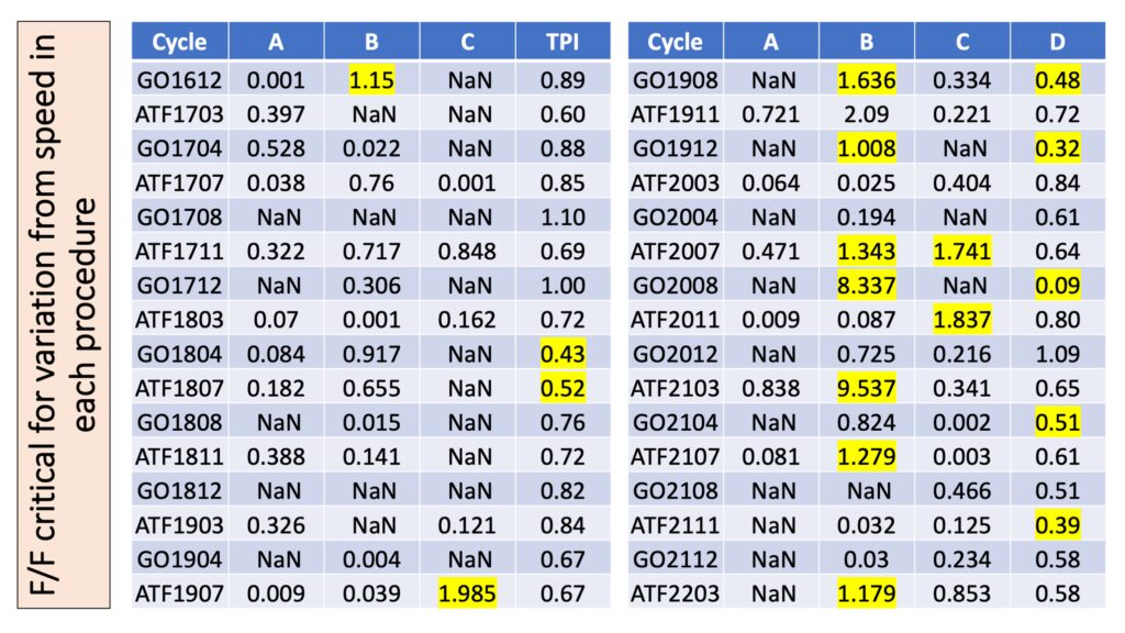
This table gives a closer look at the speed effect across any given procedure for each particular program cycle, which is tied to the sample. The columns A, B, and C show the F statistic computed for that procedure in that cycle divided by the critical F-value. A number greater than 1 indicates a statistically significant result, which is highlighted in yellow. Low TPI values are also highlighted in yellow.
Work outcomes:
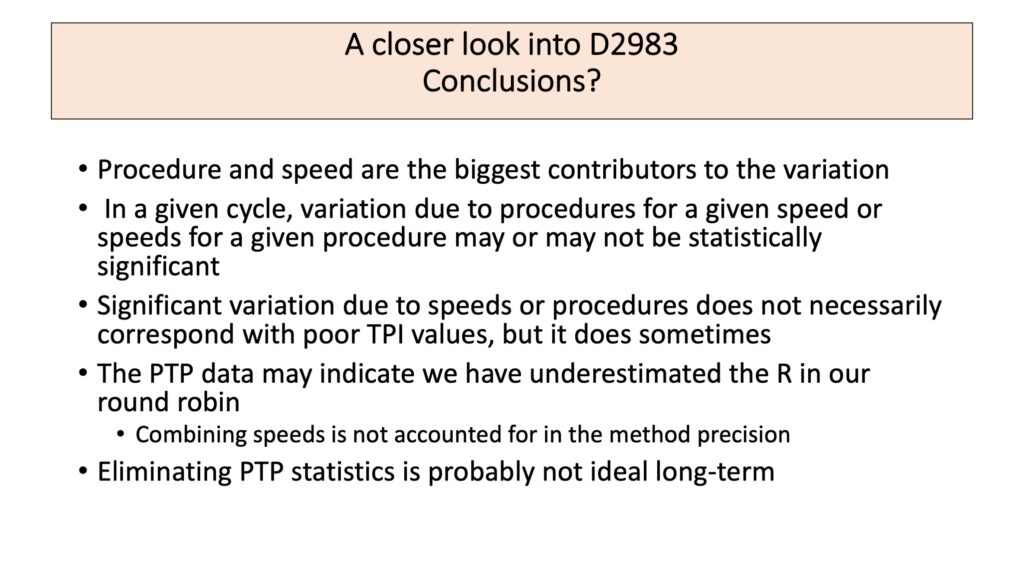
Based on the analysis and presentation, the Subcommittee was able to determine the method itself did not appear to be performing poorly and to make appropriate recommendations to labs regarding how to best use D2983 results from PTP for quality control purposes.
Preferred Regression Model
The following extension of a textbook example shows one approach Sarah might use for selecting a preferred model when many possible regressors are available. Sarah completed this example using R in a Jupyter notebook.
The data below from the 1966 J. W. Gorman and R. J. Toman paper "Selection of variables for fitting equation sto data" in Technometrics, 8, pp. 27 – 51 gives rut depth of 31 asphalt pavements prepared under different conditions. An indicator variable separates the data into two sets of runs.
$y$: rut depth per million whell passes
$x_1$: viscosity of asphalt
$x_2$: percentage of asphalt in surface course
$x_3$: percentage of asphalt in base course
$x_4$: run
$x_5$:percentage of fines in the surface course
$x_6$: percentage of voids in the surface course
The goal is to determine what regressor variables most effectively model the given data.
Based on subject matter knowldege regarding viscosity, it makes most sense to use the log of viscosity.
df_asphalt <- read.table("Table9_6.csv", sep=",", header=TRUE)
df_asphalt
| yi | xi1 | xi2 | xi3 | xi4 | xi5 | xi6 |
|---|---|---|---|---|---|---|
| <dbl> | <dbl> | <dbl> | <dbl> | <int> | <dbl> | <dbl> |
| 6.75 | 2.80 | 4.68 | 4.87 | 0 | 8.4 | 4.916 |
| 13.00 | 1.40 | 5.19 | 4.50 | 0 | 6.5 | 4.563 |
| 14.75 | 1.40 | 4.82 | 4.73 | 0 | 7.9 | 5.321 |
| 12.60 | 3.30 | 4.85 | 4.76 | 0 | 8.3 | 4.865 |
| 8.25 | 1.70 | 4.86 | 4.95 | 0 | 8.4 | 3.776 |
| 10.67 | 2.90 | 5.16 | 4.45 | 0 | 7.4 | 4.397 |
| 7.28 | 3.70 | 4.82 | 5.05 | 0 | 6.8 | 4.867 |
| 12.67 | 1.70 | 4.86 | 4.70 | 0 | 8.6 | 4.828 |
| 12.58 | 0.92 | 4.78 | 4.84 | 0 | 6.7 | 4.865 |
| 20.60 | 0.68 | 5.16 | 4.76 | 0 | 7.7 | 4.034 |
| 3.58 | 6.00 | 4.57 | 4.82 | 0 | 7.4 | 5.450 |
| 7.00 | 4.30 | 4.61 | 4.65 | 0 | 6.7 | 4.853 |
| 26.20 | 0.60 | 5.07 | 5.10 | 0 | 7.5 | 4.257 |
| 11.67 | 1.80 | 4.66 | 5.09 | 0 | 8.2 | 5.144 |
| 7.67 | 6.00 | 5.42 | 4.41 | 0 | 5.8 | 3.718 |
| 12.25 | 4.40 | 5.01 | 4.74 | 0 | 7.1 | 4.715 |
| 0.76 | 88.00 | 4.97 | 4.66 | 1 | 6.5 | 4.625 |
| 1.35 | 62.00 | 4.01 | 4.72 | 1 | 8.0 | 4.977 |
| 1.44 | 50.00 | 4.96 | 4.90 | 1 | 6.8 | 4.322 |
| 1.60 | 58.00 | 5.20 | 4.70 | 1 | 8.2 | 5.087 |
| 1.10 | 90.00 | 4.80 | 4.60 | 1 | 6.6 | 5.971 |
| 0.85 | 66.00 | 4.98 | 4.69 | 1 | 6.4 | 4.647 |
| 1.20 | 140.00 | 5.35 | 4.76 | 1 | 7.3 | 5.115 |
| 0.56 | 240.00 | 5.04 | 4.80 | 1 | 7.8 | 5.939 |
| 0.72 | 420.00 | 4.80 | 4.80 | 1 | 7.4 | 5.916 |
| 0.47 | 500.00 | 4.83 | 4.60 | 1 | 6.7 | 5.471 |
| 0.33 | 180.00 | 4.66 | 4.72 | 1 | 7.2 | 4.602 |
| 0.26 | 270.00 | 4.67 | 4.50 | 1 | 6.3 | 5.043 |
| 0.76 | 170.00 | 4.72 | 4.70 | 1 | 6.8 | 5.075 |
| 0.80 | 98.00 | 5.00 | 5.07 | 1 | 7.2 | 4.334 |
| 2.00 | 35.00 | 4.70 | 4.80 | 1 | 7.7 | 5.705 |
The R library "olsrr" contains different algortihms that test different combinations of parameters to find a preferred set of regressors for the model.
library("olsrr")
rut <- df_asphalt$yi
lnvisc<-log(df_asphalt$xi1)
surf <- df_asphalt$xi2
base <- df_asphalt$xi3
run <- df_asphalt$xi4
fines <- df_asphalt$xi5
voids <-df_asphalt$xi6
df_asphalt_xform <- data.frame("rut"=rut, "ln.vis"=lnvisc, "surf"=surf, "base"=base,
                               "run"=run, "fines"=fines, "voids"=voids)
The full model would use all regressors and provides an input to the "all combinations" algorithm and a basis against which to measure model effectiveness.
asphalt_fm <-lm(rut ~ ln.vis + surf + base + run + fines + voids, data=df_asphalt_xform, x=TRUE)
summary(asphalt_fm)
Call:
lm(formula = rut ~ ln.vis + surf + base + run + fines + voids,
    data = df_asphalt_xform, x = TRUE)

Residuals:
    Min      1Q  Median      3Q     Max
-4.1211 -1.9075 -0.7175  1.6382  9.5947

Coefficients:
            Estimate Std. Error t value Pr(>|t|)
(Intercept) -14.9592    25.2881  -0.592   0.5597
ln.vis       -3.1515     0.9194  -3.428   0.0022 **
surf          3.9706     2.4966   1.590   0.1248
base          1.2631     3.9703   0.318   0.7531
run           1.9655     3.6472   0.539   0.5949
fines         0.1164     1.0124   0.115   0.9094
voids         0.5893     1.3244   0.445   0.6604
---
Signif. codes:  0 '***' 0.001 '**' 0.01 '*' 0.05 '.' 0.1 ' ' 1

Residual standard error: 3.324 on 24 degrees of freedom
Multiple R-squared:  0.806,	Adjusted R-squared:  0.7575
F-statistic: 16.62 on 6 and 24 DF,  p-value: 1.743e-07
At least one variable is significant, and the $R^2=.80$, which indicates the model explains a reasonable portion of the variation in the rut depth. It appears that only $\ln(\mathrm{viscosity})$ is significant, but this could be misleading as all variables are included in the model at this point.
Consider the residuals:
qqnorm(asphalt_fm$resid); qqline(asphalt_fm$resid)
plot(asphalt_fm$fitted,asphalt_fm$resid,main="Residuals of full model",
     xlab=expression(hat(y[i])), ylab=expression(e[i]))
There appear to be one or two significant outliers in the tails, and the residuals show a curved relationship with the most negative values around 5 and most positive values at the ends. This indicates that the model is inadequate.
Plot the residuals against each regressor to see where the full model fails.
plot(df_asphalt_xform$ln.vis, asphalt_fm$resid, xlab="log of viscosity",ylab="residuals")
plot(df_asphalt_xform$surf, asphalt_fm$resid, xlab="% asphalt in surface",ylab="residuals")
plot(df_asphalt_xform$base, asphalt_fm$resid, xlab="% asphalt in base",ylab="residuals")
plot(df_asphalt_xform$run, asphalt_fm$resid, xlab="run",ylab="residuals")
plot(df_asphalt_xform$fines, asphalt_fm$resid, xlab="fines in surface",ylab="residuals")
plot(df_asphalt_xform$voids, asphalt_fm$resid, xlab="voids in surface",ylab="residuals")
The log of viscosity vs. the residuals shows a definite curve, similar to the overall residuals plot. There may also be a different relationship for low and high viscosity samples. The plot of residuals in the runs show more variability for the first run (represented by 0), which is distinctly influenced by an apparent outlier. When residuals are plotted against the other regressors, the trend is not so obvious, but there does appear to be at least one outlier.
Transforming the response variable, rut depth, should stabilize the errors so that statistical techniques for assessing the fit will be reliable.
ln.rut <- log(df_asphalt_xform$rut)
df_asphalt_xform2 <- df_asphalt_xform
df_asphalt_xform2$ln.rut<-ln.rut
asphalt2_fm <- lm(ln.rut ~ ln.vis + surf + base + run + fines + voids, x=TRUE,
                  data=df_asphalt_xform2)
summary(asphalt2_fm)
Call:
lm(formula = ln.rut ~ ln.vis + surf + base + run + fines + voids,
    data = df_asphalt_xform2, x = TRUE)

Residuals:
     Min       1Q   Median       3Q      Max
-0.53072 -0.18563 -0.00003  0.20017  0.55079

Coefficients:
            Estimate Std. Error t value Pr(>|t|)
(Intercept) -1.23294    2.34970  -0.525    0.605
ln.vis      -0.55769    0.08543  -6.528 9.45e-07 ***
surf         0.58358    0.23198   2.516    0.019 *
base        -0.10337    0.36891  -0.280    0.782
run         -0.34005    0.33889  -1.003    0.326
fines        0.09775    0.09407   1.039    0.309
voids        0.19885    0.12306   1.616    0.119
---
Signif. codes:  0 '***' 0.001 '**' 0.01 '*' 0.05 '.' 0.1 ' ' 1

Residual standard error: 0.3088 on 24 degrees of freedom
Multiple R-squared:  0.961,	Adjusted R-squared:  0.9512
F-statistic: 98.47 on 6 and 24 DF,  p-value: 1.059e-15
Notice that at least one regressor is still important, the $R^2$ is very good (though it cannot be compared directly because the response was trasnformed), and there now appear to be at least 3 coefficients with significant values.
Try the residual plots again.
qqnorm(asphalt2_fm$resid); qqline(asphalt2_fm$resid)
plot(asphalt2_fm$fitted,asphalt2_fm$resid,
     main="residuals of model with response log of rut depth",xlab=expression(hat(y[i])),
     ylab=expression(e[i]))
plot(df_asphalt_xform2$ln.vis, asphalt2_fm$resid, main="Residuals for ln(rut depth)",
     xlab="log of viscosity",ylab="residuals")
plot(df_asphalt_xform2$surf, asphalt2_fm$resid, main="Residuals for ln(rut depth)",
     xlab="% asphalt in surface",ylab="residuals")
plot(df_asphalt_xform2$base, asphalt2_fm$resid, main="Residuals for ln(rut depth)",
     xlab="% asphalt in base",ylab="residuals")
plot(df_asphalt_xform2$run, asphalt2_fm$resid,main="Residuals for ln(rut depth)",
     xlab="run",ylab="residuals")
plot(df_asphalt_xform2$fines, asphalt2_fm$resid, main="Residuals for ln(rut depth)",
     xlab="fines in surface",ylab="residuals")
plot(df_asphalt_xform2$voids, asphalt2_fm$resid, main="Residuals for ln(rut depth)",
     xlab="voids in surface",ylab="residuals")
The residuals look much better, though there is still a difference in variability between the runs. There no longer seems to be an outlier.
I will use an all-regressions approach to selecting which parameters can best be used for this model, assessing the best 10 according to the adjusted $R^2$ and Mallow’s $C_p$, which are known to be effective criteria for assessing regressions.
asphalt_all <- ols_step_all_possible(asphalt2_fm)
top.10.by.adjr<-sort.list(asphalt_all$result$adjr, decreasing=TRUE, method="auto")[1:10]
selection.by.adjr<-asphalt_all$result[top.10.by.adjr,1:length(asphalt_all$result)]
selection.by.adjr
top.10.by.cp<-sort.list(asphalt_all$result$cp, method="auto")[1:10]
selection.by.cp<-asphalt_all$result[top.10.by.cp,1:length(asphalt_all$result)]
selection.by.cp
| mindex | n | predictors | rsquare | adjr | rmse | predrsq | cp | aic | sbic | sbc | msep | fpe | apc | hsp | |
|---|---|---|---|---|---|---|---|---|---|---|---|---|---|---|---|
| <int> | <int> | <chr> | <dbl> | <dbl> | <dbl> | <dbl> | <dbl> | <dbl> | <dbl> | <dbl> | <dbl> | <dbl> | <dbl> | <dbl> | |
| 25 | 22 | 3 | ln.vis surf voids | 0.9578631 | 0.9531812 | 0.2823055 | 0.9360162 | 2.906603 | 19.55872 | -66.91993 | 26.72866 | 2.844547 | 0.1033101 | 0.05462192 | 0.003519356 |
| 60 | 57 | 5 | ln.vis surf run fines voids | 0.9608365 | 0.9530038 | 0.2721629 | 0.9277106 | 5.078511 | 21.29020 | -63.39979 | 31.32811 | 2.864141 | 0.1096275 | 0.05796203 | 0.003827085 |
| 46 | 42 | 4 | ln.vis surf run voids | 0.9591996 | 0.9529226 | 0.2777924 | 0.9291244 | 4.084907 | 20.55954 | -65.16782 | 29.16347 | 2.864498 | 0.1068488 | 0.05649290 | 0.003680348 |
| 47 | 43 | 4 | ln.vis surf fines voids | 0.9589206 | 0.9526007 | 0.2787403 | 0.9333344 | 4.256398 | 20.77075 | -65.03275 | 29.37468 | 2.884081 | 0.1075793 | 0.05687911 | 0.003705509 |
| 44 | 44 | 4 | ln.vis surf base voids | 0.9579092 | 0.9514337 | 0.2821510 | 0.9326247 | 4.878267 | 21.52480 | -64.54857 | 30.12872 | 2.955094 | 0.1102281 | 0.05827960 | 0.003796747 |
| 63 | 63 | 6 | ln.vis surf base run fines voids | 0.9609642 | 0.9512052 | 0.2717188 | 0.9218579 | 7.000000 | 23.18896 | -60.87204 | 34.66085 | 2.978924 | 0.1168992 | 0.06180674 | 0.004146312 |
| 59 | 58 | 5 | ln.vis surf base fines voids | 0.9593265 | 0.9511918 | 0.2773599 | 0.9309323 | 6.006861 | 22.46294 | -62.75020 | 32.50085 | 2.974569 | 0.1138542 | 0.06019676 | 0.003974639 |
| 58 | 59 | 5 | ln.vis surf base run voids | 0.9592078 | 0.9510493 | 0.2777644 | 0.9225907 | 6.079855 | 22.55330 | -62.69971 | 32.59121 | 2.983251 | 0.1141865 | 0.06037247 | 0.003986241 |
| 45 | 45 | 4 | ln.vis surf run fines | 0.9565107 | 0.9498200 | 0.2868001 | 0.9350426 | 5.738098 | 22.53806 | -63.89300 | 31.14198 | 3.053279 | 0.1138906 | 0.06021600 | 0.003922897 |
| 24 | 23 | 3 | ln.vis surf fines | 0.9534561 | 0.9482845 | 0.2967013 | 0.9377030 | 5.616119 | 22.64236 | -64.67926 | 29.81230 | 3.142053 | 0.1141151 | 0.06033471 | 0.003887437 |
| mindex | n | predictors | rsquare | adjr | rmse | predrsq | cp | aic | sbic | sbc | msep | fpe | apc | hsp | |
|---|---|---|---|---|---|---|---|---|---|---|---|---|---|---|---|
| <int> | <int> | <chr> | <dbl> | <dbl> | <dbl> | <dbl> | <dbl> | <dbl> | <dbl> | <dbl> | <dbl> | <dbl> | <dbl> | <dbl> | |
| 25 | 22 | 3 | ln.vis surf voids | 0.9578631 | 0.9531812 | 0.2823055 | 0.9360162 | 2.906603 | 19.55872 | -66.91993 | 26.72866 | 2.844547 | 0.1033101 | 0.05462192 | 0.003519356 |
| 46 | 42 | 4 | ln.vis surf run voids | 0.9591996 | 0.9529226 | 0.2777924 | 0.9291244 | 4.084907 | 20.55954 | -65.16782 | 29.16347 | 2.864498 | 0.1068488 | 0.05649290 | 0.003680348 |
| 47 | 43 | 4 | ln.vis surf fines voids | 0.9589206 | 0.9526007 | 0.2787403 | 0.9333344 | 4.256398 | 20.77075 | -65.03275 | 29.37468 | 2.884081 | 0.1075793 | 0.05687911 | 0.003705509 |
| 44 | 44 | 4 | ln.vis surf base voids | 0.9579092 | 0.9514337 | 0.2821510 | 0.9326247 | 4.878267 | 21.52480 | -64.54857 | 30.12872 | 2.955094 | 0.1102281 | 0.05827960 | 0.003796747 |
| 60 | 57 | 5 | ln.vis surf run fines voids | 0.9608365 | 0.9530038 | 0.2721629 | 0.9277106 | 5.078511 | 21.29020 | -63.39979 | 31.32811 | 2.864141 | 0.1096275 | 0.05796203 | 0.003827085 |
| 7 | 7 | 2 | ln.vis surf | 0.9508647 | 0.9473550 | 0.3048489 | 0.9376697 | 5.209344 | 22.32198 | -65.49655 | 28.05793 | 3.194137 | 0.1128471 | 0.05966428 | 0.003810740 |
| 24 | 23 | 3 | ln.vis surf fines | 0.9534561 | 0.9482845 | 0.2967013 | 0.9377030 | 5.616119 | 22.64236 | -64.67926 | 29.81230 | 3.142053 | 0.1141151 | 0.06033471 | 0.003887437 |
| 45 | 45 | 4 | ln.vis surf run fines | 0.9565107 | 0.9498200 | 0.2868001 | 0.9350426 | 5.738098 | 22.53806 | -63.89300 | 31.14198 | 3.053279 | 0.1138906 | 0.06021600 | 0.003922897 |
| 23 | 24 | 3 | ln.vis surf run | 0.9530103 | 0.9477892 | 0.2981188 | 0.9332149 | 5.890199 | 22.93786 | -64.46277 | 30.10780 | 3.172147 | 0.1152081 | 0.06091259 | 0.003924671 |
| 59 | 58 | 5 | ln.vis surf base fines voids | 0.9593265 | 0.9511918 | 0.2773599 | 0.9309323 | 6.006861 | 22.46294 | -62.75020 | 32.50085 | 2.974569 | 0.1138542 | 0.06019676 | 0.003974639 |
The highest $R^2_{Adj}$ is an indicator of a preferred model. I will plot this parameter versus the number of parameters to visualize the gains made by adding additional parameters to the model.
plot(selection.by.adjr$n,selection.by.adjr$adjr,xlab="p",ylab=expression(R[Adj]^2),
     xlim=c(3,7),col="blue")
text(selection.by.adjr$n+.27,selection.by.adjr$adjr-.0001,labels=selection.by.adjr$predictors)
Based on the $R^2_{Adj}$ the model using ln(viscosity), % asphalt in surface, run, and voids in surface, may be preferred.
Mallow’s $C_p$ is a statistic related to the sean square error of a fitted value. For a model with negligable bias, the expectation value of $C_p$ is $p$, the number of parameters. So the lowest value close to the line $C_p=p$ indicates a lower bias of the fitted value. I will plot $C_p$ versus $p$ to visualize this relationship.
plot(selection.by.cp$n,selection.by.cp$cp,xlab="p",ylab=expression(C[p]),xlim=c(2,6),ylim=c(2,6),
     col="blue")
text(selection.by.cp$n+.25,selection.by.cp$cp-.1,labels=selection.by.cp$predictors)
lines(selection.by.cp$n,selection.by.cp$n)
The smallest $C_p$, which is close to the $C_p=p$ line, and below it is ln(viscosity), %asphalt in the surface, and voids in the surface.
Therefore, this seems to be a particularly promising model.
suggested <- lm(ln.rut~ln.vis+surf+voids,data=df_asphalt_xform2,x=TRUE)
summary(suggested)
Call:
lm(formula = ln.rut ~ ln.vis + surf + voids, data = df_asphalt_xform2,
    x = TRUE)

Residuals:
     Min       1Q   Median       3Q      Max
-0.53548 -0.20181 -0.01702  0.16748  0.54707

Coefficients:
            Estimate Std. Error t value Pr(>|t|)
(Intercept) -1.02079    1.36430  -0.748   0.4608
ln.vis      -0.64649    0.02879 -22.458   <2e-16 ***
surf         0.55547    0.22044   2.520   0.0180 *
voids        0.24479    0.11560   2.118   0.0436 *
---
Signif. codes:  0 '***' 0.001 '**' 0.01 '*' 0.05 '.' 0.1 ' ' 1

Residual standard error: 0.3025 on 27 degrees of freedom
Multiple R-squared:  0.9579,	Adjusted R-squared:  0.9532
F-statistic: 204.6 on 3 and 27 DF,  p-value: < 2.2e-16
The regression is significant, and each of the regressors also appears to be statistically significant with $p<.05$. The adjusted R-squared indicates that the model explains about 95% of the variation in the rut depth, even accounting for the additional parameters included in the model.
Due diligence requires making sure this is actually a good model. First, check the residuals to ensure the assumptions of a linear regression and the statistical measures of goodness of regression are met.
qqnorm(suggested$resid);qqline(suggested$resid)
plot(suggested$fitted, suggested$resid, xlab="predicted values", ylab="residuals")
#residuals by regressors
plot(df_asphalt_xform2$ln.vis, suggested$resid, xlab="ln(viscosity)", ylab="residuals")
plot(df_asphalt_xform2$surf, suggested$resid, xlab="% asphalt in surface", ylab="residuals")
plot(df_asphalt_xform2$voids, suggested$resid, xlab="% voids in surface", ylab="residuals")
The residuals appear to be relatively normal, and there is no trend in the residuals when plotted against the predicted values or regressors, so we can consider the errors relatively constant. The statistical assumptions appear to be valid for this regression.
The PRESS statistic is the sum of the residuals when each fitted point is left out of the calculation to generate its fit and is generally considered to be a measure of how well a model is likely to predict new data, assuming the data generation process has not changed. A small value of the PRESS statistic is preferable.
asphalt2_PRESS <-sum(rstandard(suggested,type="pred")^2)
asphalt2_PRESS
An $R^2_{prediction}=1-\frac{\mathrm{PRESS}}{SS_T}$ can be calculated to estimate how much of the variabilty in predictions can be explained by the model.
SST <- sum(anova(suggested)["Sum Sq"])
Rsq.pred <- 1- asphalt2_PRESS/SST
Rsq.pred
Finally, check for influential observations, using a number of statistics.
#check for influential points
sug.DFBETAS <- dfbetas(suggested)
#sug.DFBETAS
obs_influence <- data.frame("residual"=suggested$resid, "Rstudent"=rstudent(suggested),"hii"=hatvalues(suggested),"COVRATIO"=covratio(suggested),"Cook"=cooks.distance(suggested),"DFFITS"=dffits(suggested),"DFBETAS"=sug.DFBETAS)
obs_influence
| residual | Rstudent | hii | COVRATIO | Cook | DFFITS | DFBETAS..Intercept. | DFBETAS.ln.vis | DFBETAS.surf | DFBETAS.voids | |
|---|---|---|---|---|---|---|---|---|---|---|
| <dbl> | <dbl> | <dbl> | <dbl> | <dbl> | <dbl> | <dbl> | <dbl> | <dbl> | <dbl> | |
| 1 | -0.207020660 | -0.70576134 | 0.07716063 | 1.1680732 | 1.060900e-02 | -0.204076350 | -0.0768560893 | 0.116717571 | 0.0960249500 | -0.026075463 |
| 2 | -0.196604175 | -0.68261694 | 0.11137436 | 1.2189481 | 1.489486e-02 | -0.241663052 | 0.1181669254 | 0.133181810 | -0.1427830578 | -0.044636072 |
| 3 | -0.050340501 | -0.17644761 | 0.14237719 | 1.3495420 | 1.340252e-03 | -0.071893204 | 0.0199809283 | 0.057440562 | -0.0056221636 | -0.048851682 |
| 4 | 0.441408916 | 1.53664439 | 0.05275796 | 0.8671436 | 3.130054e-02 | 0.362649335 | 0.0079638130 | -0.223043165 | -0.0229832713 | 0.082808242 |
| 5 | -0.149863137 | -0.53914638 | 0.17779940 | 1.3529136 | 1.613867e-02 | -0.250716516 | -0.1568714344 | 0.008405062 | 0.0893144917 | 0.197539157 |
| 6 | 0.133982003 | 0.45592728 | 0.08392031 | 1.2296880 | 4.904526e-03 | 0.137994730 | -0.0421271850 | -0.040168599 | 0.0710196881 | -0.019645783 |
| 7 | -0.017017293 | -0.05667237 | 0.05100291 | 1.2248480 | 4.480739e-05 | -0.013138217 | -0.0015591434 | 0.007533843 | 0.0021386531 | -0.002357769 |
| 8 | 0.021637965 | 0.07288572 | 0.07229544 | 1.2525558 | 1.074553e-04 | 0.020346657 | -0.0002626004 | -0.015007477 | -0.0006582427 | 0.005281403 |
| 9 | -0.347062555 | -1.22409327 | 0.10526642 | 1.0387986 | 4.327344e-02 | -0.419867803 | -0.0402121301 | 0.336406115 | 0.0760109013 | -0.116703187 |
| 10 | -0.056956335 | -0.19932273 | 0.13938954 | 1.3430821 | 1.668033e-03 | -0.080217405 | 0.0044150702 | 0.034118110 | -0.0232087571 | 0.025079850 |
| 11 | -0.418101761 | -1.50631695 | 0.11846143 | 0.9440012 | 7.280511e-02 | -0.552184473 | -0.0903539337 | 0.281287925 | 0.2295967575 | -0.285754755 |
| 12 | 0.160993608 | 0.54843906 | 0.08266286 | 1.2107409 | 6.956219e-03 | 0.164633838 | 0.1003748000 | -0.059636667 | -0.1102204580 | -0.014454652 |
| 13 | 0.097998379 | 0.33920436 | 0.11772149 | 1.2950462 | 3.968128e-03 | 0.123904322 | -0.0066007515 | -0.074413772 | 0.0263978164 | -0.017744946 |
| 14 | 0.010113811 | 0.03482754 | 0.11248118 | 1.3100958 | 3.990781e-05 | 0.012398635 | 0.0019529281 | -0.008873054 | -0.0041495648 | 0.005055671 |
| 15 | 0.295685995 | 1.12570714 | 0.23853276 | 1.2625268 | 9.826766e-02 | 0.630048273 | -0.1032340605 | 0.120092917 | 0.3139119750 | -0.342791899 |
| 16 | 0.547065980 | 1.94888166 | 0.04961981 | 0.7092528 | 4.492036e-02 | 0.445311916 | -0.1209803715 | -0.188283742 | 0.1605797275 | 0.047232430 |
| 17 | -0.251932423 | -0.86594058 | 0.08354090 | 1.1325473 | 1.724823e-02 | -0.261445469 | -0.0359677314 | -0.188413652 | -0.0208449235 | 0.137164535 |
| 18 | 0.543288805 | 2.65687799 | 0.44049012 | 0.7952221 | 1.134712e+00 | 2.357413788 | 2.1150712927 | 0.542259966 | -2.2282360013 | -0.881293443 |
| 19 | 0.101404291 | 0.34894568 | 0.10710733 | 1.2783385 | 3.774304e-03 | 0.120855884 | 0.0421144764 | 0.076795202 | -0.0081160680 | -0.090602555 |
| 20 | -0.017862416 | -0.06142864 | 0.11003123 | 1.3059748 | 1.211017e-04 | -0.021599390 | 0.0156665985 | -0.005099435 | -0.0166065838 | -0.006647633 |
| 21 | -0.102719201 | -0.36381402 | 0.15681515 | 1.3515051 | 6.358420e-03 | -0.156896062 | 0.0739228342 | 0.007235259 | -0.0317356661 | -0.126049977 |
| 22 | -0.336938545 | -1.16322216 | 0.07107183 | 1.0219923 | 2.554689e-02 | -0.321751320 | -0.0272310074 | -0.213208381 | -0.0420366897 | 0.154632498 |
| 23 | 0.173968579 | 0.63552900 | 0.19917308 | 1.3653508 | 2.568020e-02 | 0.316943140 | -0.2376549031 | 0.107325373 | 0.2580763864 | 0.080142661 |
| 24 | -0.269229569 | -1.00194106 | 0.21079983 | 1.2663765 | 6.702625e-02 | -0.517825831 | 0.3662536890 | -0.079906575 | -0.2768255465 | -0.366230789 |
| 25 | 0.482814188 | 1.81731199 | 0.16284224 | 0.8610369 | 1.479844e-01 | 0.801510790 | -0.2914672760 | 0.274021695 | 0.1280330729 | 0.456758555 |
| 26 | 0.261282603 | 0.91896278 | 0.12162475 | 1.1650758 | 2.940264e-02 | 0.341954924 | -0.0500982902 | 0.226732573 | 0.0250327008 | 0.058833748 |
| 27 | -0.445690716 | -1.66286622 | 0.16359128 | 0.9280503 | 1.269094e-01 | -0.735407603 | -0.4870032936 | -0.532962391 | 0.3814422075 | 0.493012813 |
| 28 | -0.535480749 | -1.98303819 | 0.11657957 | 0.7494093 | 1.170250e-01 | -0.720374902 | -0.3287467441 | -0.536080072 | 0.3066572006 | 0.248401867 |
| 29 | 0.202467248 | 0.69300775 | 0.08513846 | 1.1814374 | 1.139274e-02 | 0.211408915 | 0.0768102687 | 0.146654474 | -0.0739972777 | -0.052536665 |
| 30 | -0.076486031 | -0.26711913 | 0.13479790 | 1.3294844 | 2.878166e-03 | -0.105435723 | -0.0273290777 | -0.077036995 | -0.0014893891 | 0.074619760 |
| 31 | 0.005193694 | 0.01779541 | 0.10357264 | 1.2972551 | 9.498850e-06 | 0.006048852 | -0.0012598435 | -0.001080200 | -0.0004417806 | 0.004360873 |
#concerning limit for hii
2*3/31
# suggested limit for DFFITS
2*sqrt(3/31)
#suggested limit for DFBETAS
2/sqrt(31)
#suggested COVRATIO Upper Limit
1+3*3/31
#suggested COVRATIO Lower Limit
1-3*3/31
Observation 18 has the largest value of hii, indicating it has most leverage. It also happens to be the largest outlier, per its RStudent of 2.66, but it is less than 3 standard deviations from the predicted value. It’s Cook’s Distance is over 1 and its DFFITS value is higher than the ideal limit of $2\sqrt{\frac{p}{n}}$, so it definitely has influence. Per the COVRATIO, it is affecting the precision of the fit. The DFFITS values indicate it is primarily influencing the value of the coefficients for the intercept (which is not significant) and the % of asphalt in the surface course. While this could be of concern if there are questions about the accuracy of observation 18, the model on the whole seems acceptable.
Next, check for multicollinearity, or regressors that share a significant portion of the same information.
# calculate VIFs
sug.lnvis <- summary(lm(ln.vis~surf+voids,data=df_asphalt_xform2))$r.squared
sug.surf <- summary(lm(surf~ln.vis+voids,data=df_asphalt_xform2))$r.squared
sug.voids <- summary(lm(voids~ln.vis+surf,data=df_asphalt_xform2))$r.squared
sug.VIF <- 1-1/c(sug.lnvis,sug.surf,sug.voids)
sug.VIF
- -3.49436861369904
- -6.25279456551605
- -2.15776390772964
There is some multicollinearity, as we would prefer to have VIF less than 3, but it does not appear to be severe and probably will not cause problems in the model.
To use this model, it would be helpful to know what the simultaneous 95% confidence level for the coefficients and for future predictions would be.
#calculate the simultaneous interval estimates using the Bonferroni method
cat("lower CI\n")
summary(suggested)$coefficients[1:4,1]-qt(.05/(2*4),27,lower.tail=FALSE)*summary(suggested)$coefficients[1:4,2]
cat("upper CI\n")
summary(suggested)$coefficients[1:4,1]+qt(.05/(2*4),27,lower.tail=FALSE)*summary(suggested)$coefficients[1:4,2]
lower CI
- (Intercept)
- -4.67201398747139
- ln.vis
- -0.723531032935349
- surf
- -0.0344899544010845
- voids
- -0.0645768360959533
upper CI
- (Intercept)
- 2.6304249985205
- ln.vis
- -0.569451150865691
- surf
- 1.14542709920293
- voids
- 0.554163704243565
#prediction 95% confidence interval
sug.ci.int <- function(vis,surf,voids){
    input <- c(1,log(vis),surf,voids)
    t(input)%*%solve(t(suggested$x)%*%suggested$x)%*%input
}
sug.ci.ll <- function(y,vis, surf, voids) {
    output <- y
    for (i in 1:length(y)) {
        output[i] <- y[i] - qt(.05/2,27,lower.tail=FALSE)*sqrt(summary(suggested)$sigma^2*(1+sug.ci.int(vis[i],surf[i],voids[i])))
    }
    output
}

sug.ci.ul <- function(y,vis, surf, voids) {
    output <- y
    for (i in 1:length(y)) {
        output[i] <- y[i] + qt(.05/2,27,lower.tail=FALSE)*sqrt(summary(suggested)$sigma^2*(1+sug.ci.int(vis[i],surf[i],voids[i])))
    }
    output
}
newdata<-data.frame("ln.vis"=log(seq(1,500)),surf=rep(5,500),voids=rep(5,500))
newys <- predict(suggested,newdata)
plot(log(seq(1,500)),newys, xlab="ln(viscosity)", ylab="predicted ln(rut depth)", main="predicted values with changing viscosity\nand % asphalt in surface and voids set to 5%",type="l")
points(log(seq(1,500)),sug.ci.ll(newys,seq(1,500),rep(5,500),rep(5,500)),type="l",lty=3)
points(log(seq(1,500)),sug.ci.ul(newys,seq(1,500),rep(5,500),rep(5,500)),type="l",lty=3)
legend("topright",legend=c("predicted values","95% CI"),lty=c(1,3))

